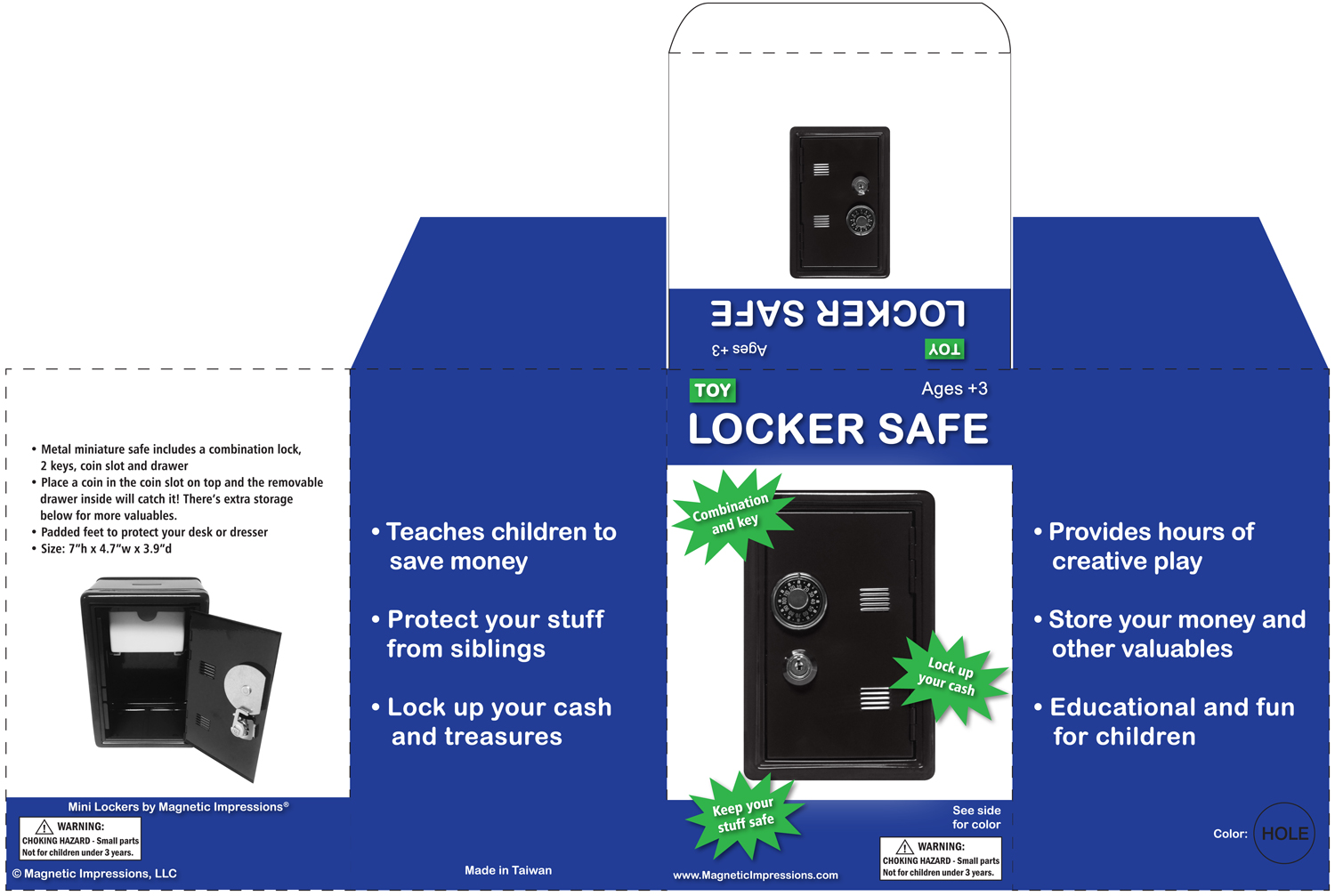
This is an example of product packaging I've designed. The parameters were to use as few colors as possible to keep costs down and to work with the die shape the production company was using. I chose the primary blue and pops of lime green to appeal to children and sans serif fonts to make the information bold and legible.

Locker Safe Packaging Layout
